Amp status
Sole designer on Driver team
/
Feature redesign
/
Once set up, the Amp automatically pairs with the driver's phone every time it's turned on. When a driver opened the app, they would see an error message that the Amp is not connected even if it was in the process of doing so.
This missing context caused drivers to go into settings and manually re-set up their Amp, wasting 3-5 minutes every time they started driving.
Drivers had to tap the error to see what's wrong. Confusion over errors and status led some drivers to drive around with their Amp on but not connected, and others to drive with their Amp turned off.
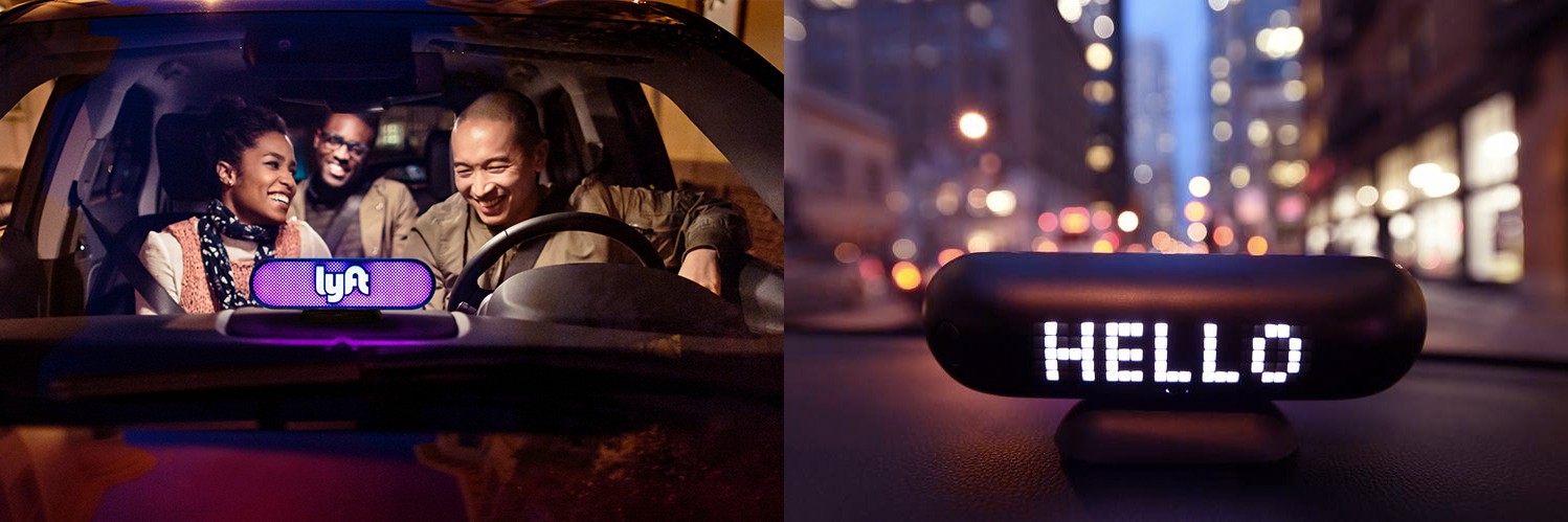
The Amp is a device which helps riders find their driver's car, greets them when they enter, and shares ride updates for pickups or dropoffs. The bright pink light acts as a brand ambassador for Lyft as the car drives around, even when there are no riders.
Lyft wanted to fill in missing gaps of Amp communication and update the user experience to better convey all its different issues and states.
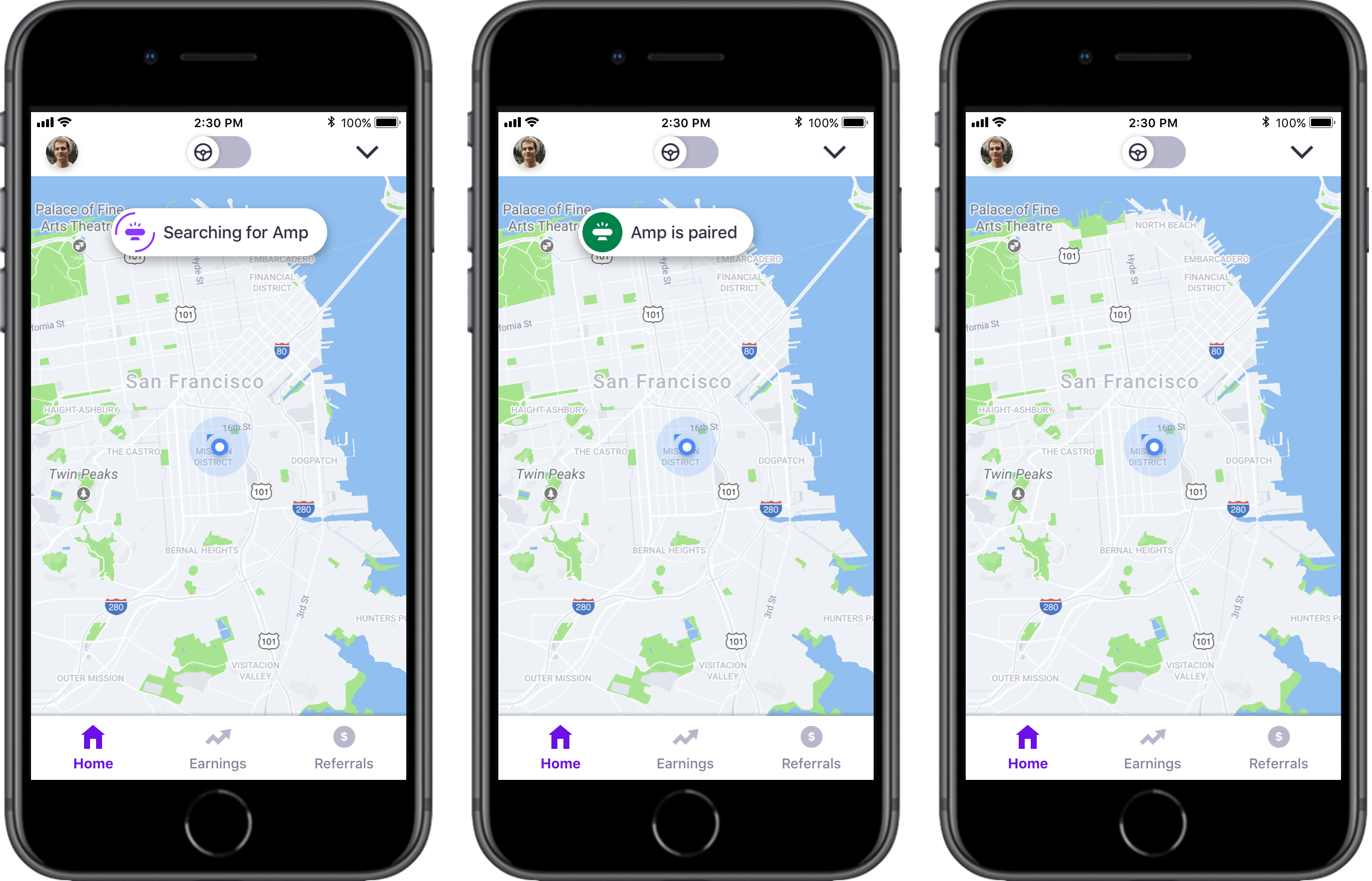
The message comes into the screen temporarily with large enough text to quickly communicate to the driver, and goes away on its own after some time.
It's important that the communication remains simple and short since the driver may be on the road, or preparing to start accepting ride requests.
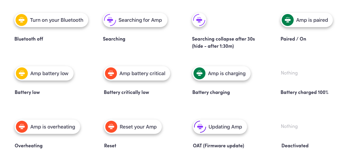
Each status has a designated color to easily know how to react without even reading – green for positive, yellow for warning, red for severe issue, and purple for a functional update.
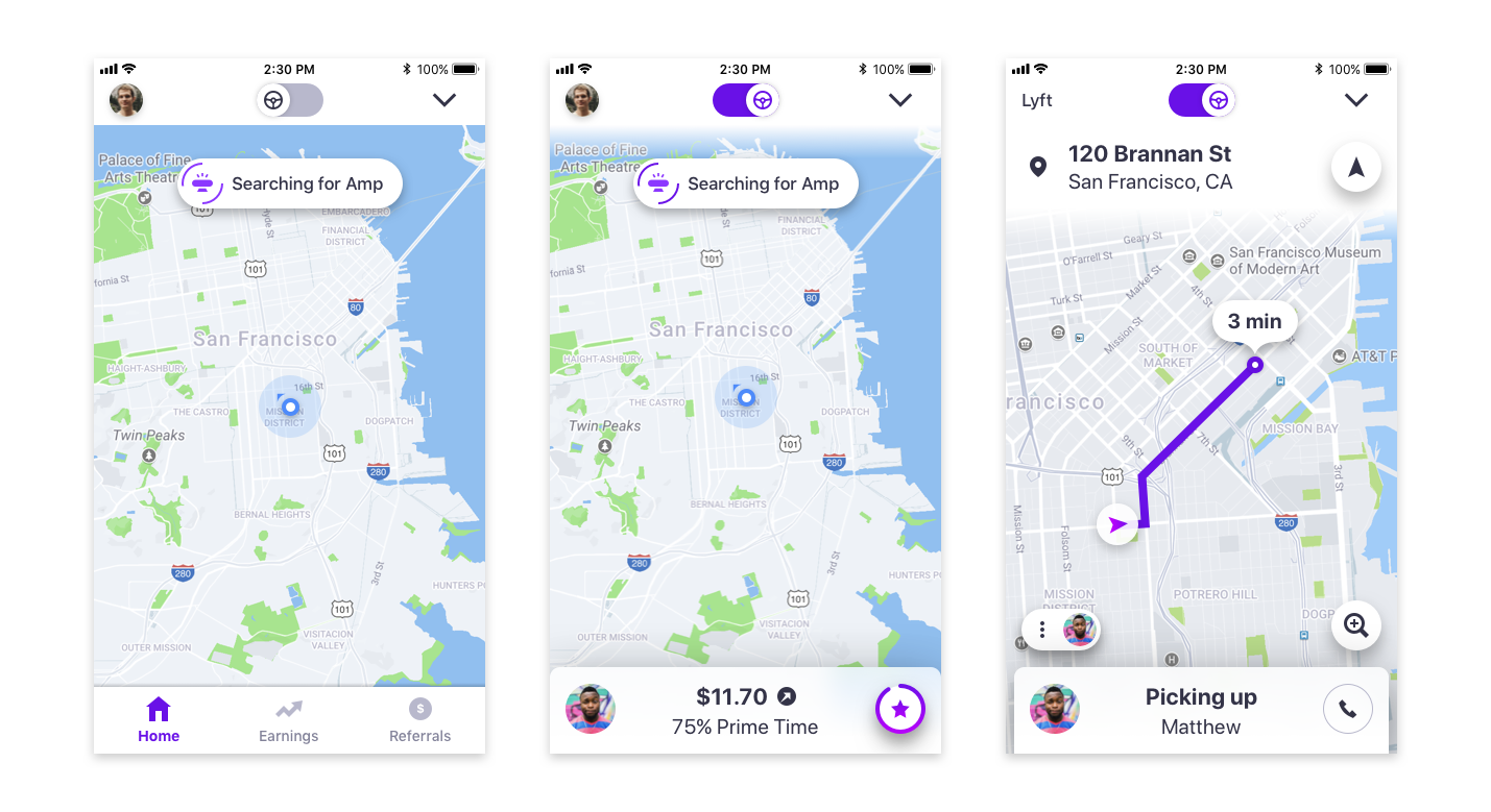
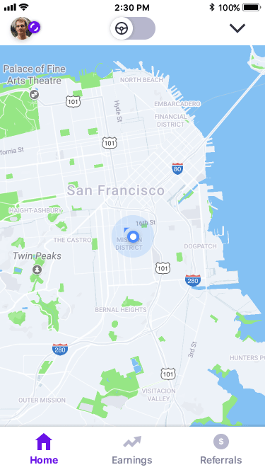
To prevent distraction on the road, the status shows on the map only when the driver is offline or idle – not while picking up riders.
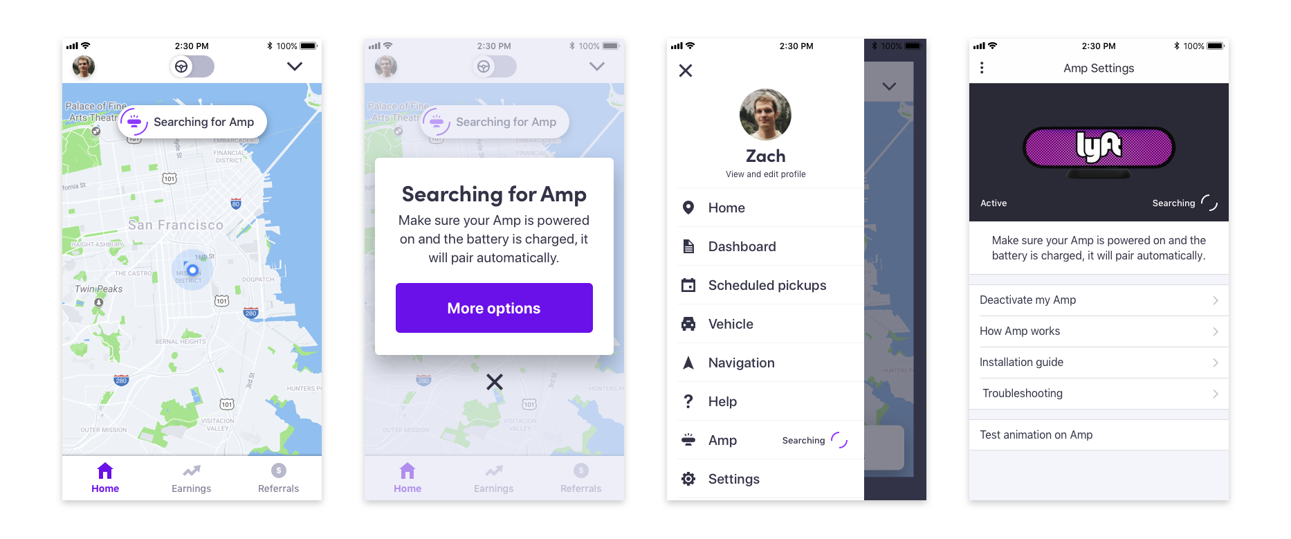
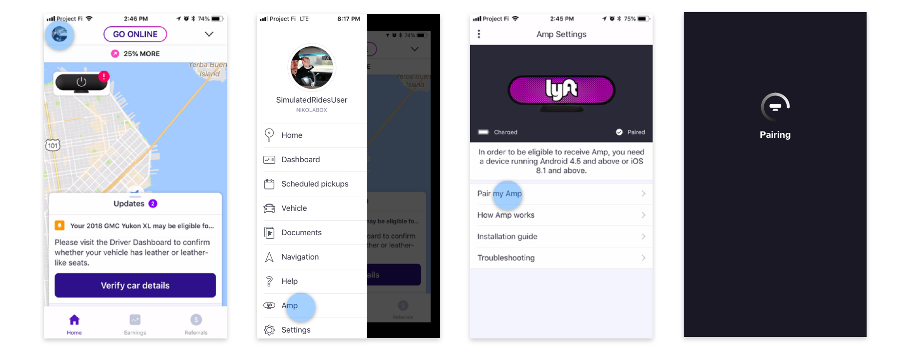
Tapping the messages provides more context and options to disable them. The status is also shown in the side menu, and the amp settings page to ensure the driver is aware and does not go through unnecessary steps.
To account for every type of issue and state, I mapped them all out and showed how they would appear in the main screen, modal, side menu, and Amp settings.
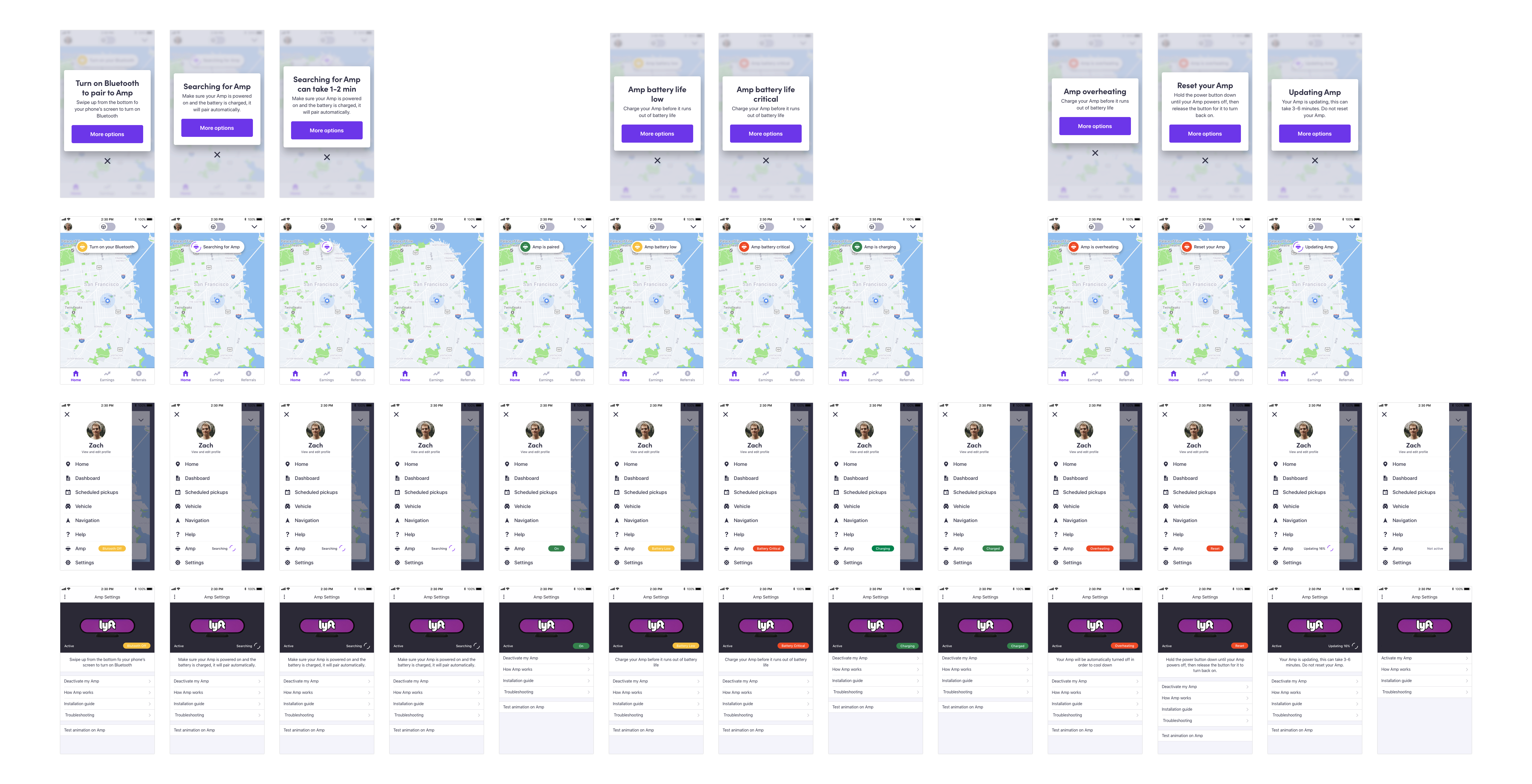
Each status has a different level of importance, which means some – like battery issues – show more prominently in all states while others – like on status – only show in settings.
I initially tried to identify every possible place we could potentially communicate in the existing driver experience. After speaking to a few designers on the team I learned that the top half of the screen had ride status and controls while the bottom had info about earnings and goals.
Since the Amp affected ride status, it seemed fitting to include it with the information in the top of the screen.
I was exploring options to either show the status with a persistent icon or small message vs a larger message that would only show up temporarily.
A Lyft driver is preoccupied in the car and likely has the phone far from their face. Scanning large text is better than tapping a small icon, and the Amp status did not seem critical enough to remain visible at all times.