Customer onboarding
Sole designer on Customer team
/
New feature
/
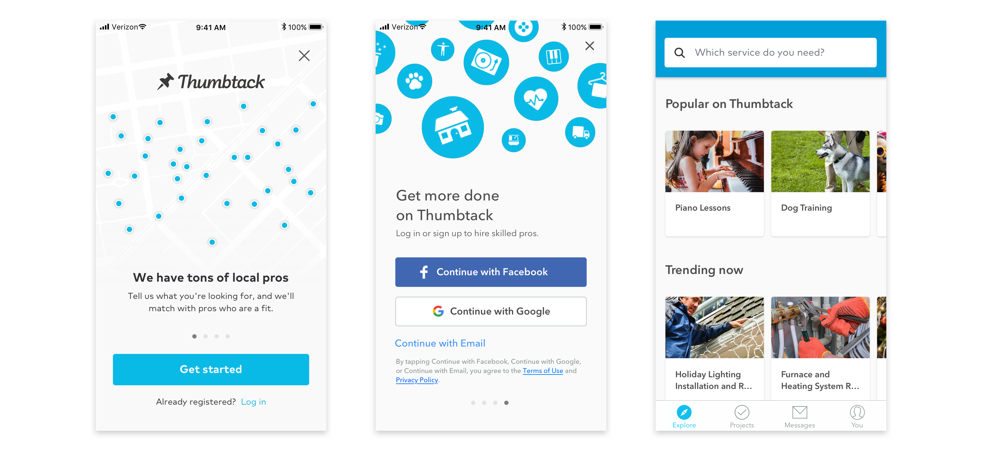
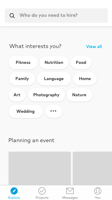
Thumbtack has many categories of services, and it's difficult to get a full understanding with a busy feed.
The first screen customers saw was a generic feed of popular services, which might deter those with a specific category in mind. We did not know anything about the new customer's interests before showing suggestions.
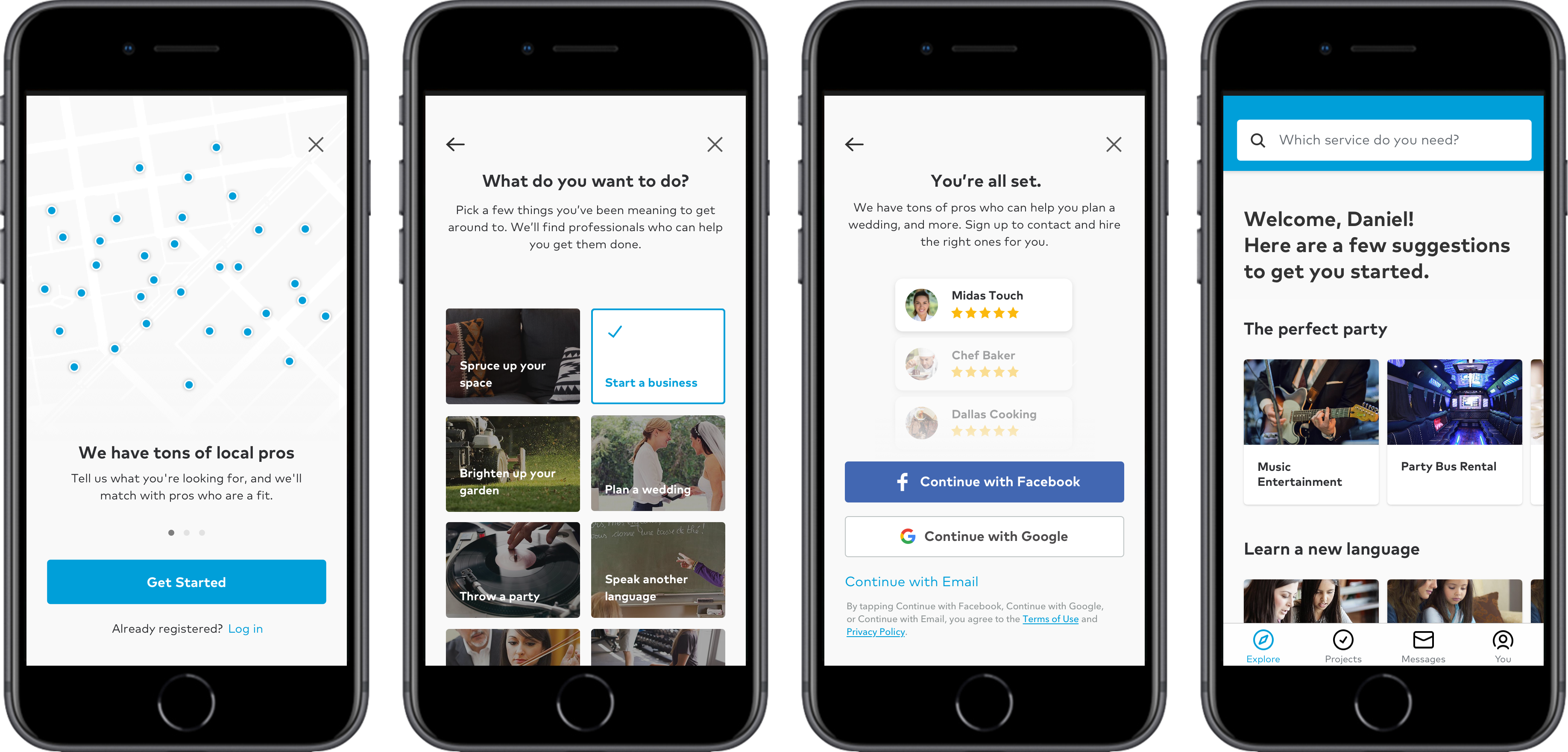
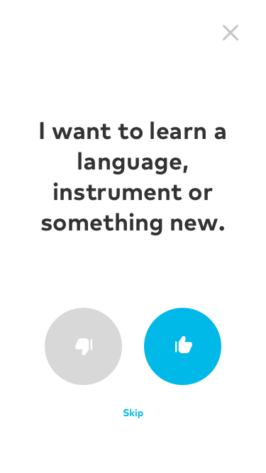
The proposal was a low friction, visual, and user friendly way to educate new users on what Thumbtack has to offer while simultaneously letting them customize their suggestions accordingly.
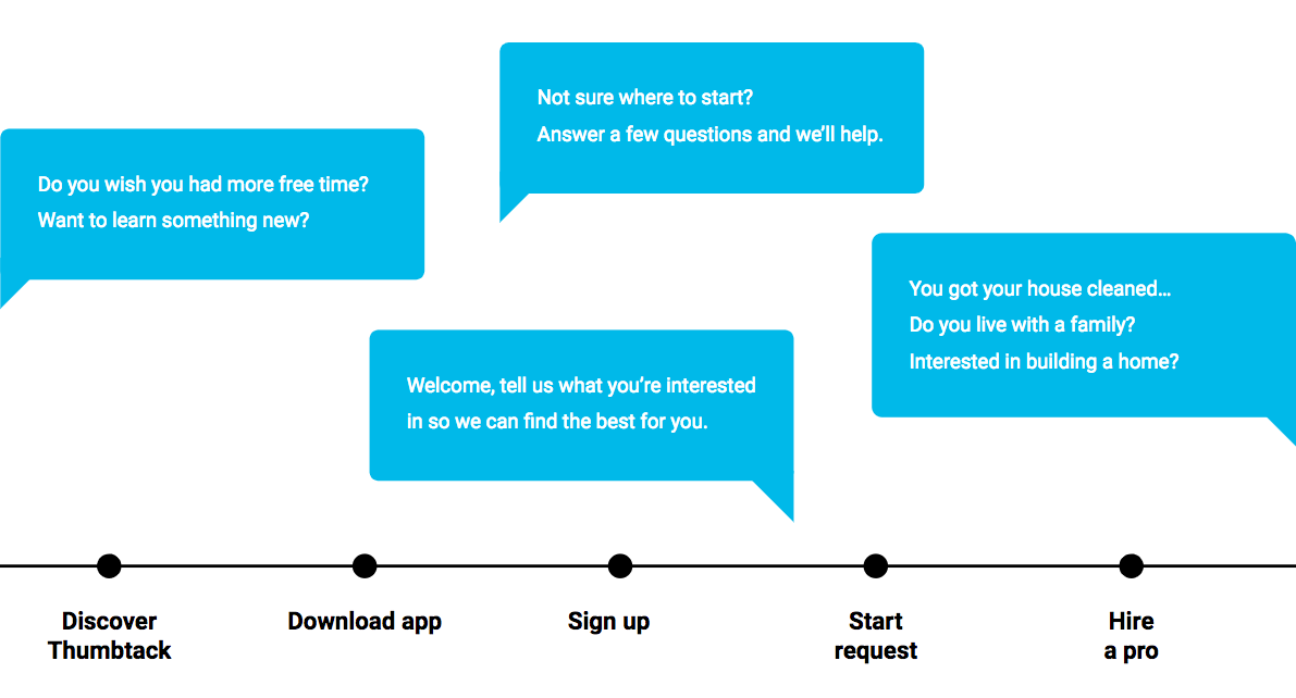
There are moments of opportunity to solicit information throughout the customer timeline. A new user's first impression is important. If the first group of suggested services doesn't relate to their interest, it may be hard to see initial value.
While personalization can be useful at any point, it is most useful for new users. The initial experiments were focused on prompts during sign up.
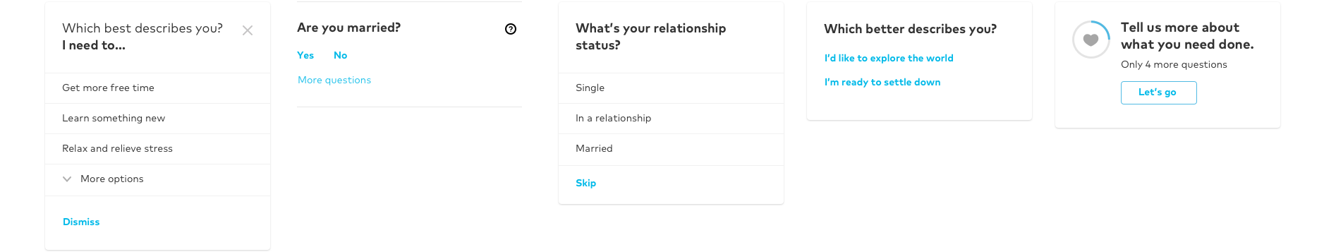
Tone and language make all the difference. Should it feel like a survey or feel actionable? Should it be conversational or feel like instructional?

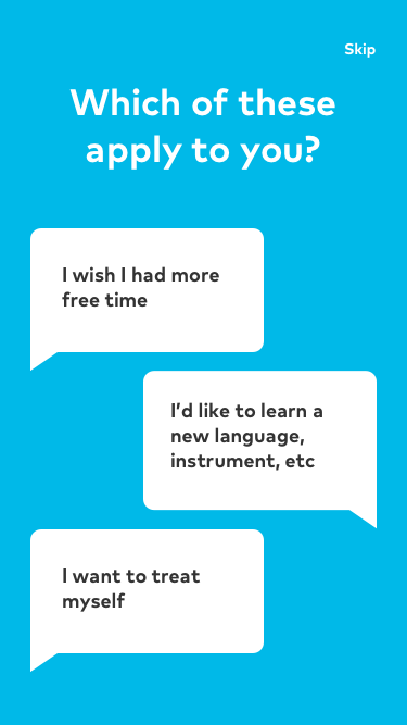
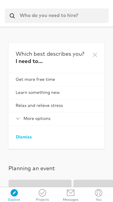
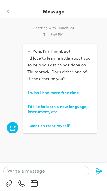
Inline feed interactions, quick feedback, interest selection, and full screen questionnaires can all be implemented into any tab. Interest selection is more common in other popular apps.
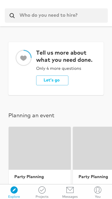
The image thumbnails helped illustrate the value of what Thumbtack has to offer on first impression.
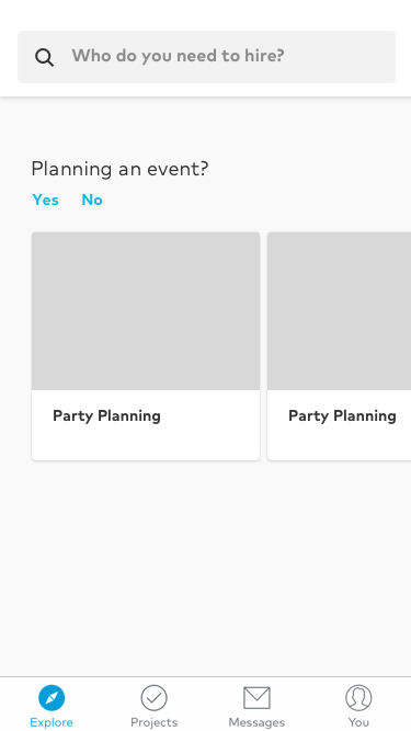
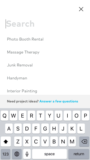
The team wanted to try an alternative approach that puts search front and center to encourage new users to fill out their first request, and remove initial wizard screens and anything else that could cause friction – an alternative to a multi-step onboarding experience prior to seeing search and browsing.
My proposal was to have search prominently in the middle, with a smooth and easy affordance to the feed of suggested services. This should encourage customers to search first before getting distracted with other content.
If this approach increases engagement, we can potentially promote personalization onboarding down in the feed.