Web player redesign
Sole designer on Core team
/
Visual redesign
/
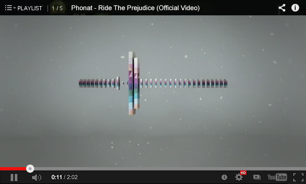
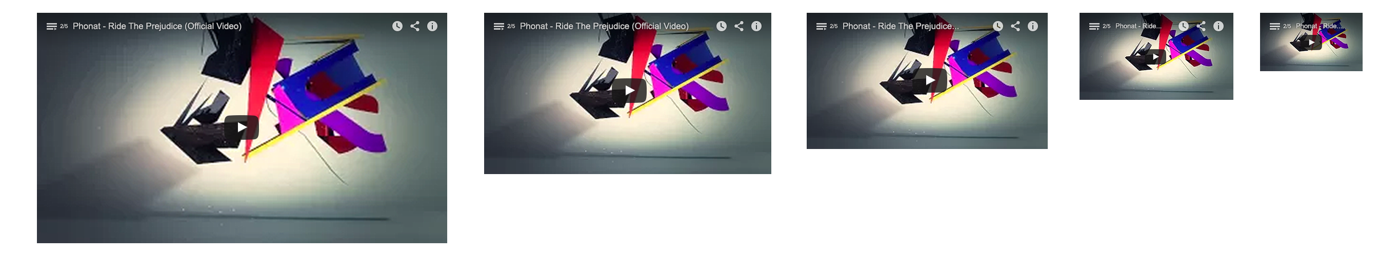
The player's visual design has not changed in years while the rest of the web styles and patterns have evolved. The new design needed to work well inside both old and future YouTube, Facebook and Twitter posts, and other websites.
New embedded video players were spreading, drawing users away from embedding videos with YouTube. The influx of players was diluting YouTube's brand presence and making its player look indistinguishable.
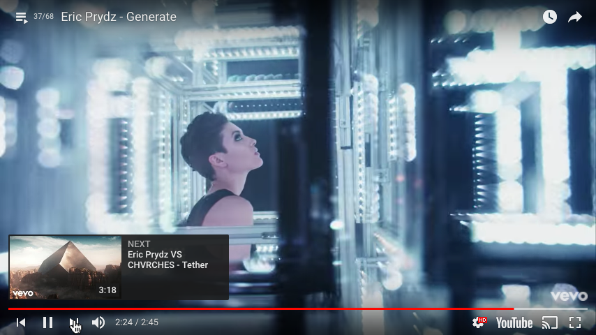
The new player utilized new Material Design icons, put all the different tooltips and elements on grid lines, and made various interactions easier to click so viewers can go back to watching more quickly.
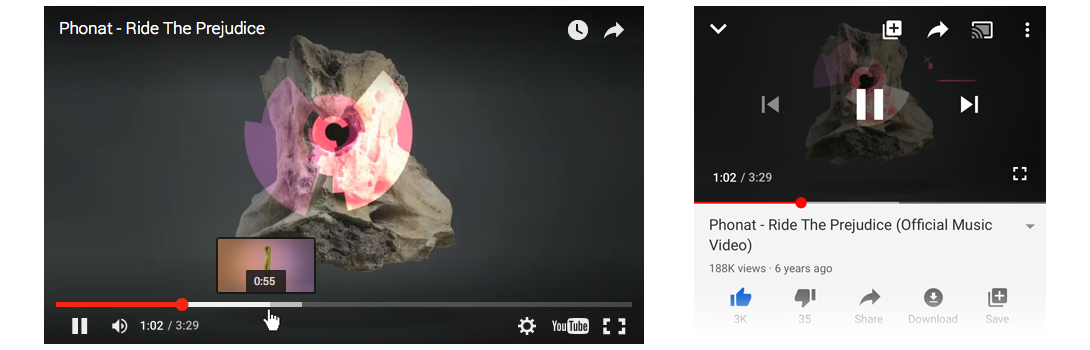
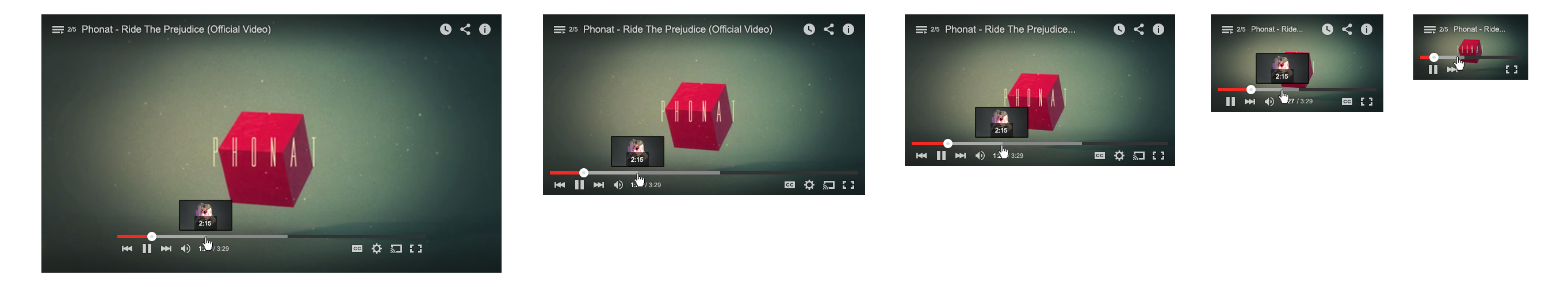
While seemingly simple, the decision to hide playback controls while not in use was a big concern to the team. When we tested it, watch time was not impacted, and the player felt much more respectful of the content.
By adding space around the seekbar, turning the black bars into more subtle transparent gradients, we were able to lighten the visual weight both on the platform itself and all around the web.
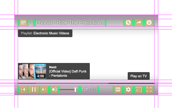
Consistent spacing helped make the icons and their groups feel balanced. Grid alignment helped bring all the various tooltips, overlays, and settings into one unified visual system.
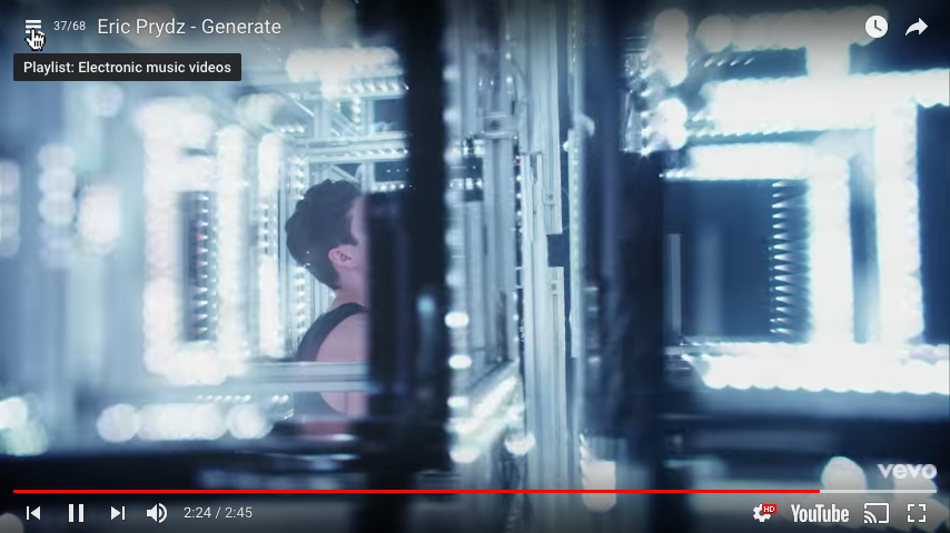
Rather than crowding the video with many different elements, certain interactions hid the rest of the controls. This helped viewers complete the action quickly and return to watching.
The seekbar was updated to match mobile, with some added desktop-specific hover interactions, and became a unified brand ambassador across all platforms.
Controls, playback settings, captions, seeking, sharing, and other interactions all had to work harmoniously. When searching for the right visual style, I kept trying out different player states to see if they worked across all the others.
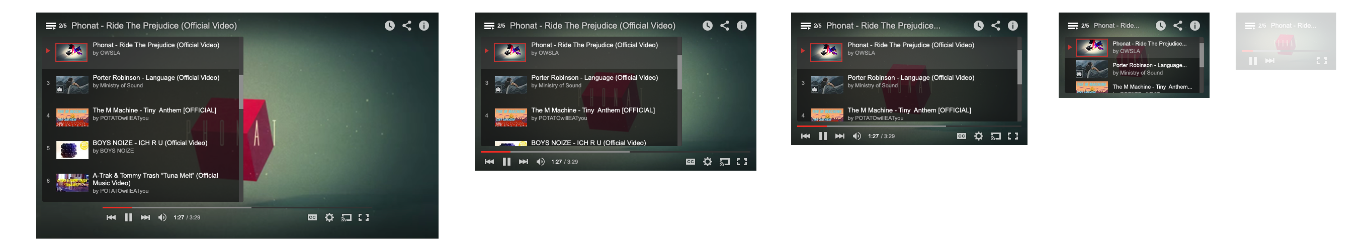
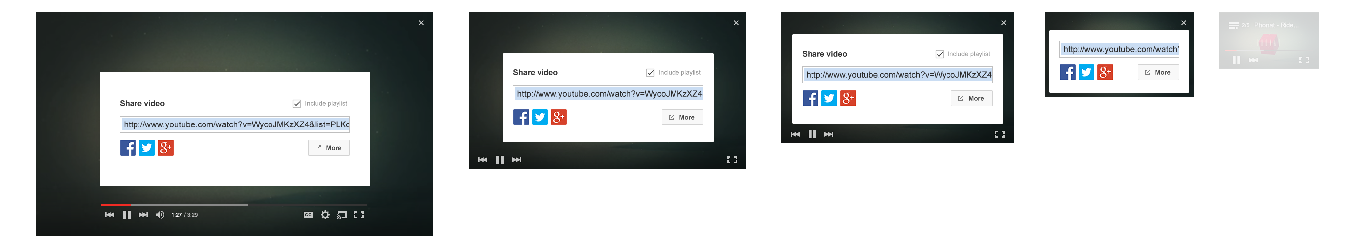
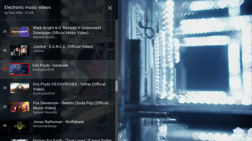
The size of the player impacts how to best utilize the space and functionality. Full screen, big and small, and infinite size options in embedding required specific rules to define responsive behavior.
How to enable YouTube's new transparent player

YouTube’s Web video player just received a sleek transparent update

With 1 billion+ users, a successful launch usually translates to little to no complaints or negative impact. Surprisingly, many were eager to opt in to the player months before launch via YouTube's experiments page. The news mentions and comments on twitter seemed mostly positive, confirming a step in the right direction.